MDERME Branding
& Packaging Design
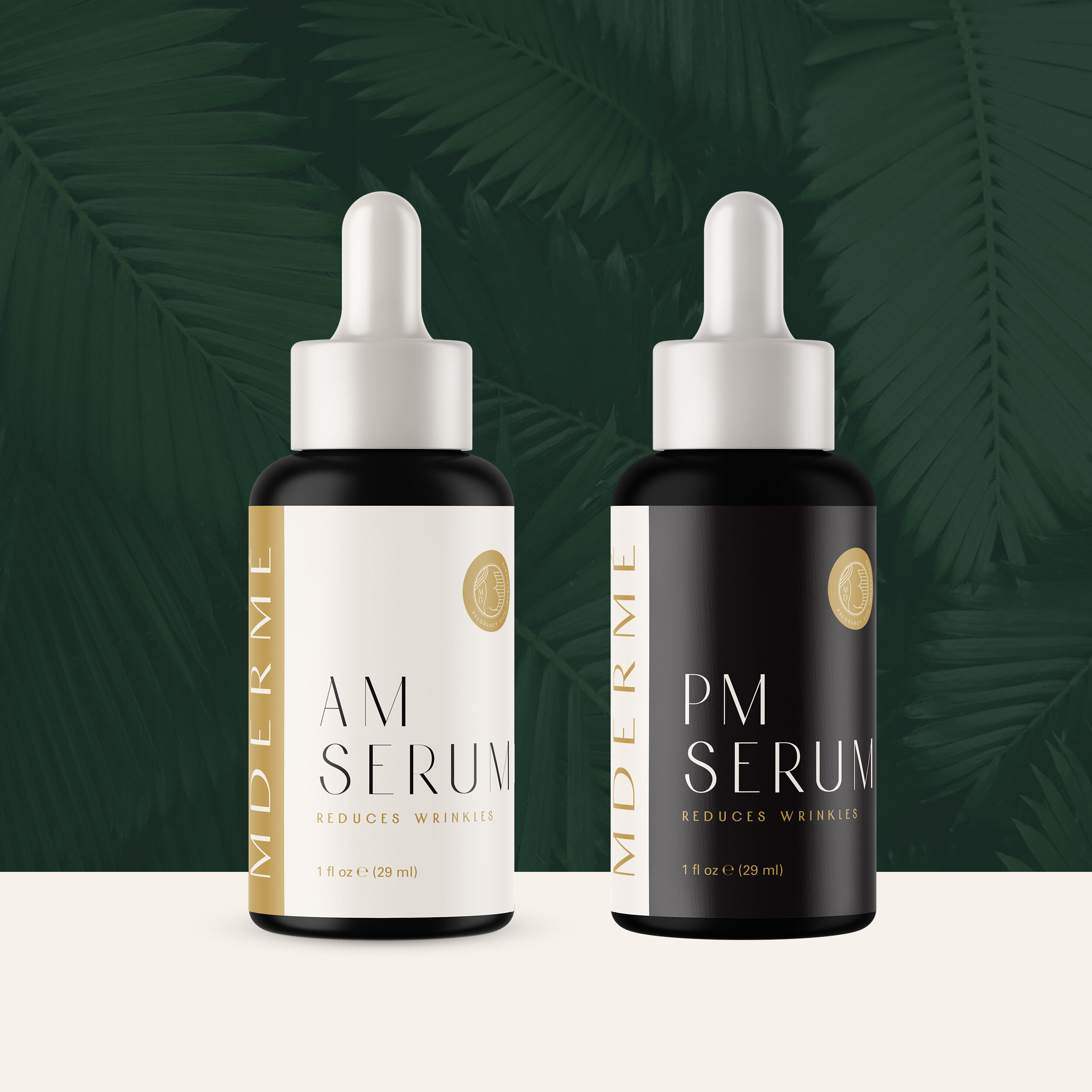
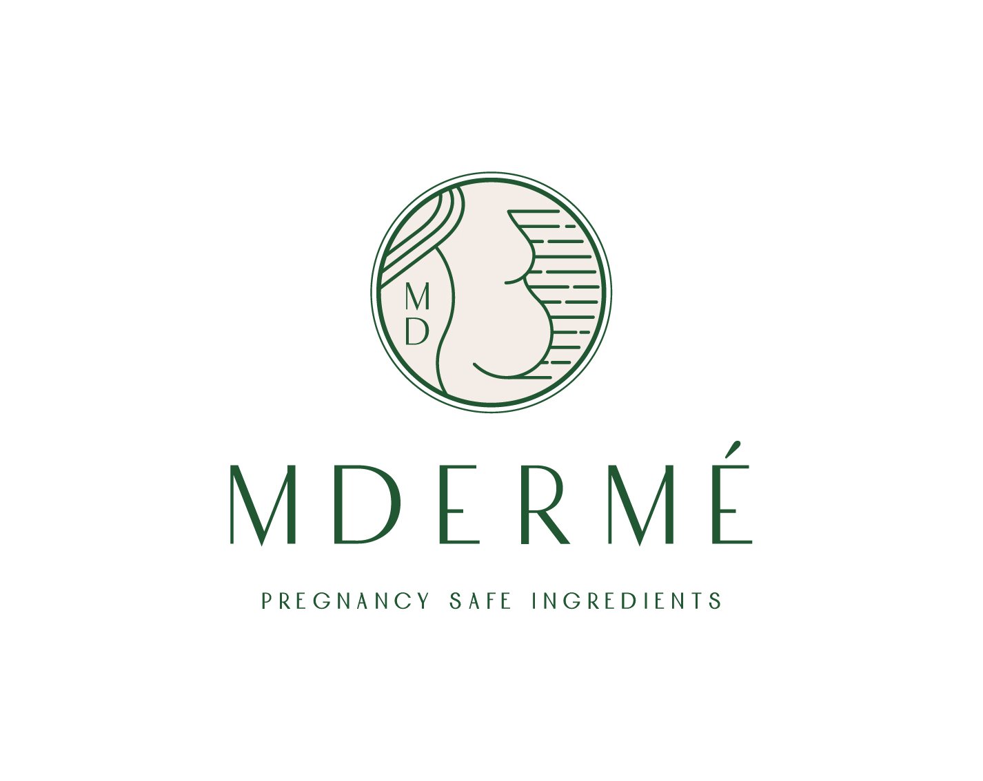
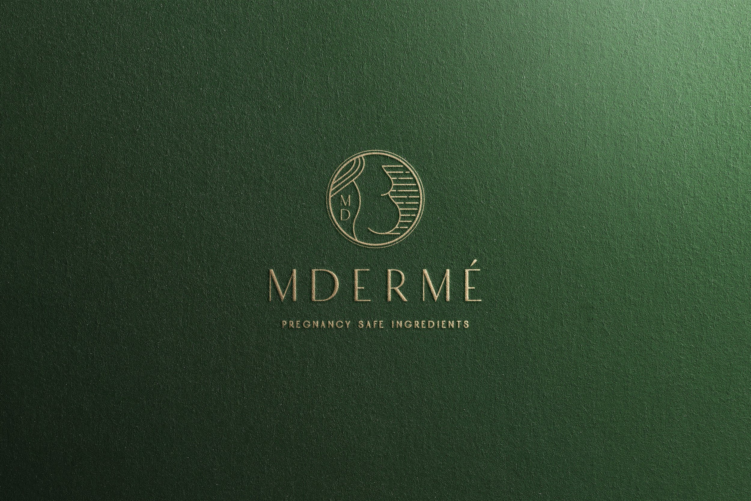
MDERME provides pregnancy safe skincare to women on their motherhood journey. Their products are currently in production and the brand is ever-evolving. When I was commissioned, the clients wanted to create an elegant and sophisticated brand that had art deco ties. The proposed solution was a custom hand drawn illustration of a pregnant woman’s silhouette done in modern art deco linear style paired with bold colors.
The mood
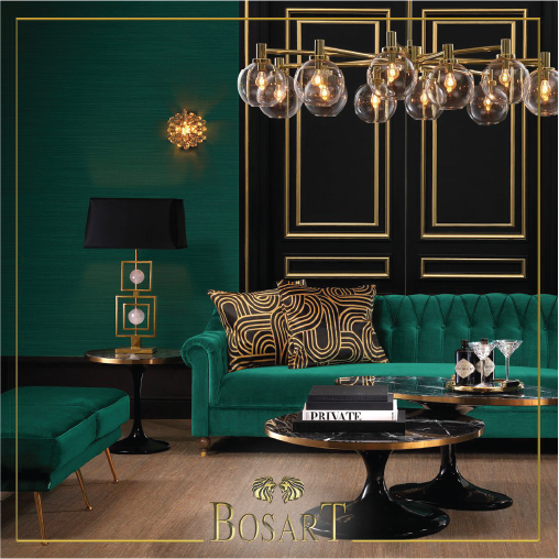
Art Deco with a modern contemporary aesthetic. Incorporating rich green hues with gold accents. Clean lines, minimal but also elegant and feminine.




Packaging Concepts
MDERMÉ empowers women to make informed choices about the skincare ingredients they choose at all stages of life – especially before, during, and following pregnancy.
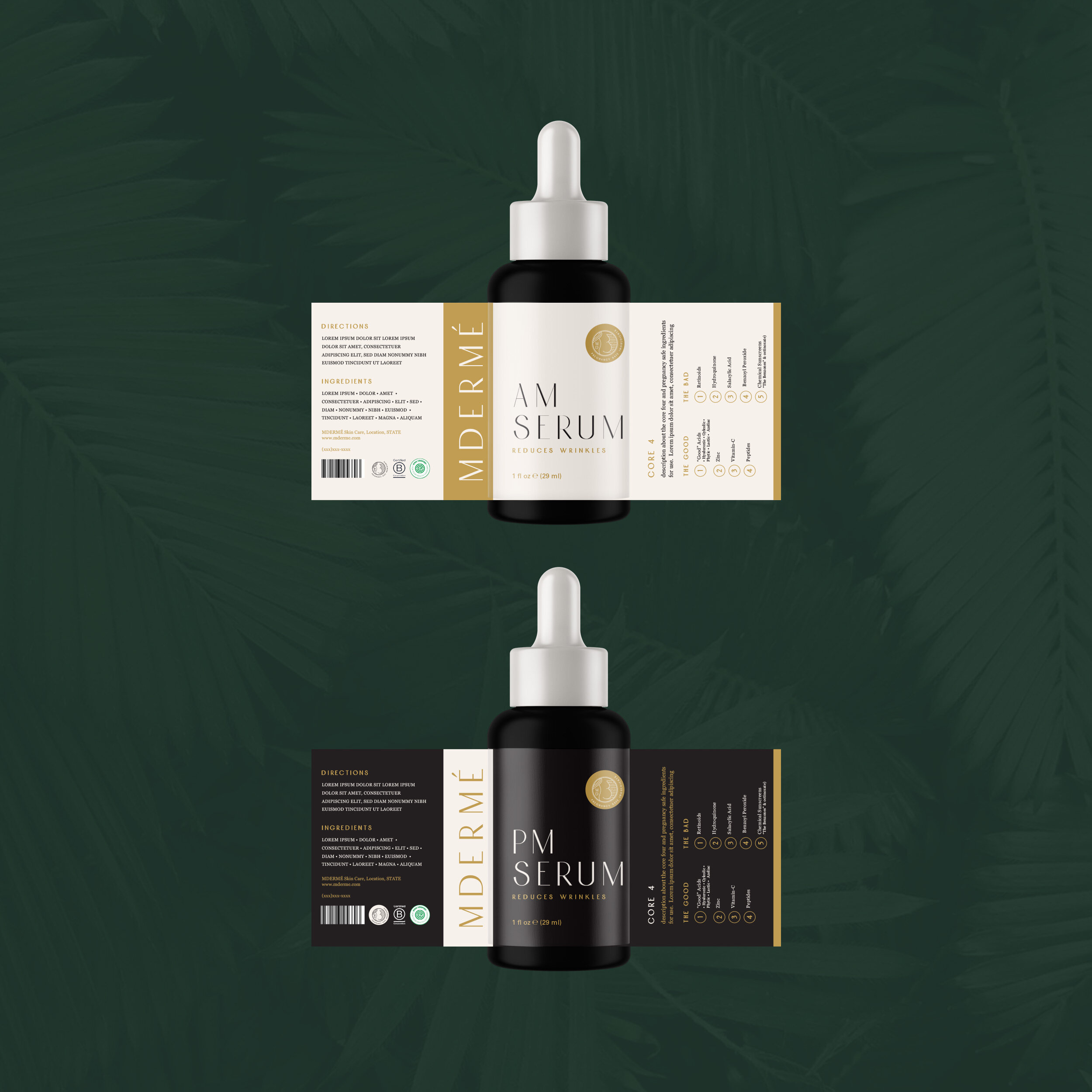
With this focus on ingredients, the label would be used as a educational guide to help women understand and recognize ingredients that would be good for them to utilize during their pregnancy and bad ingredients to avoid.
The design combines art deco font, paired with a soft feminine elegance and french inspiration. Pulling in colors from the brand guide and creating a system that can expand across different packaging products.
