BLEVE Corporation Branding
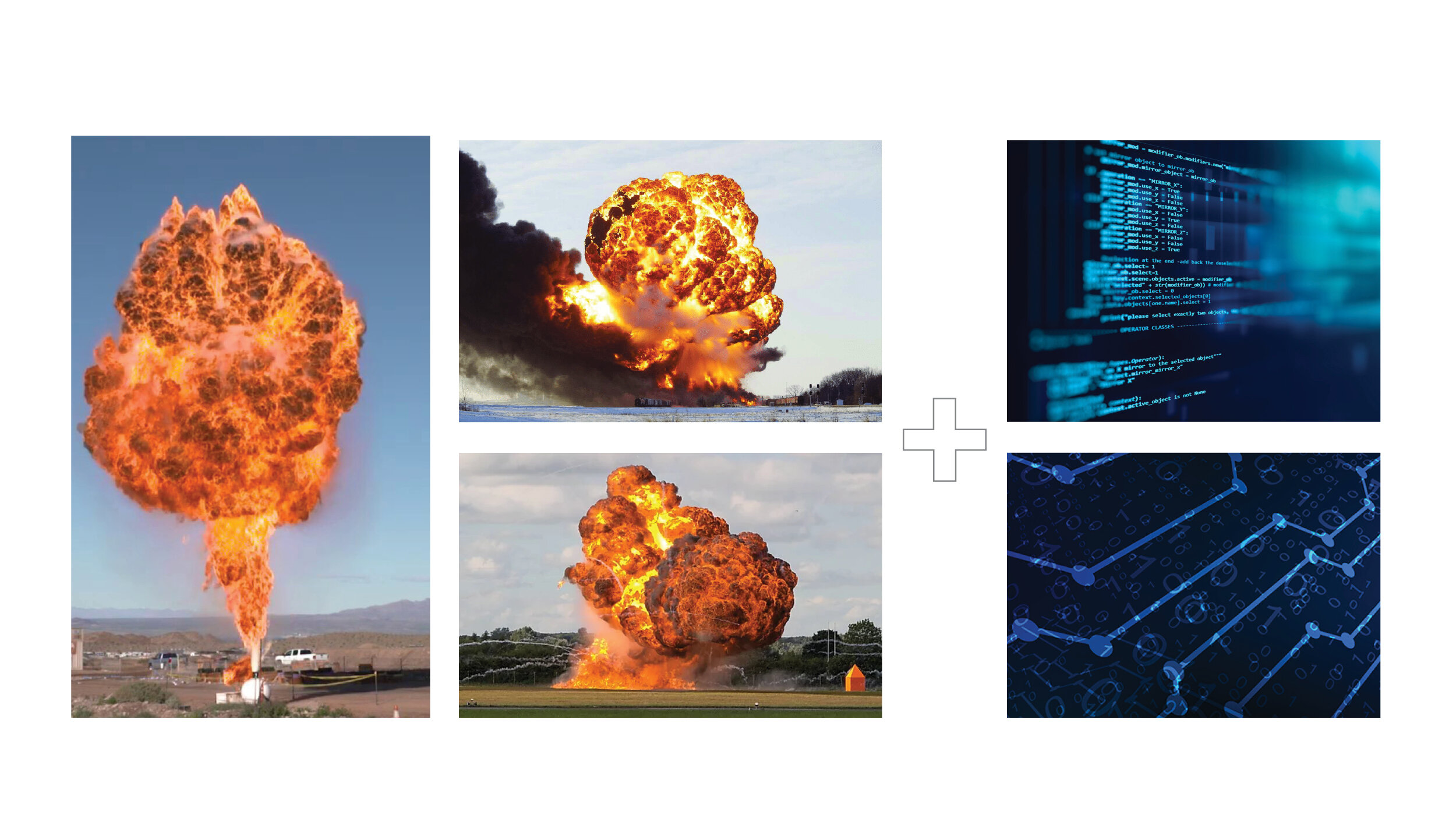
I was commissioned to develop a new logo identity for an IT contracting company. The name BLEVE comes from the term “boiling liquid expanding vapor explosion”, which was chosen as a nod to the owner’s volunteer firefighting past. The brand requirements were to combine the elements of an explosion with the digital IT nature of the company.
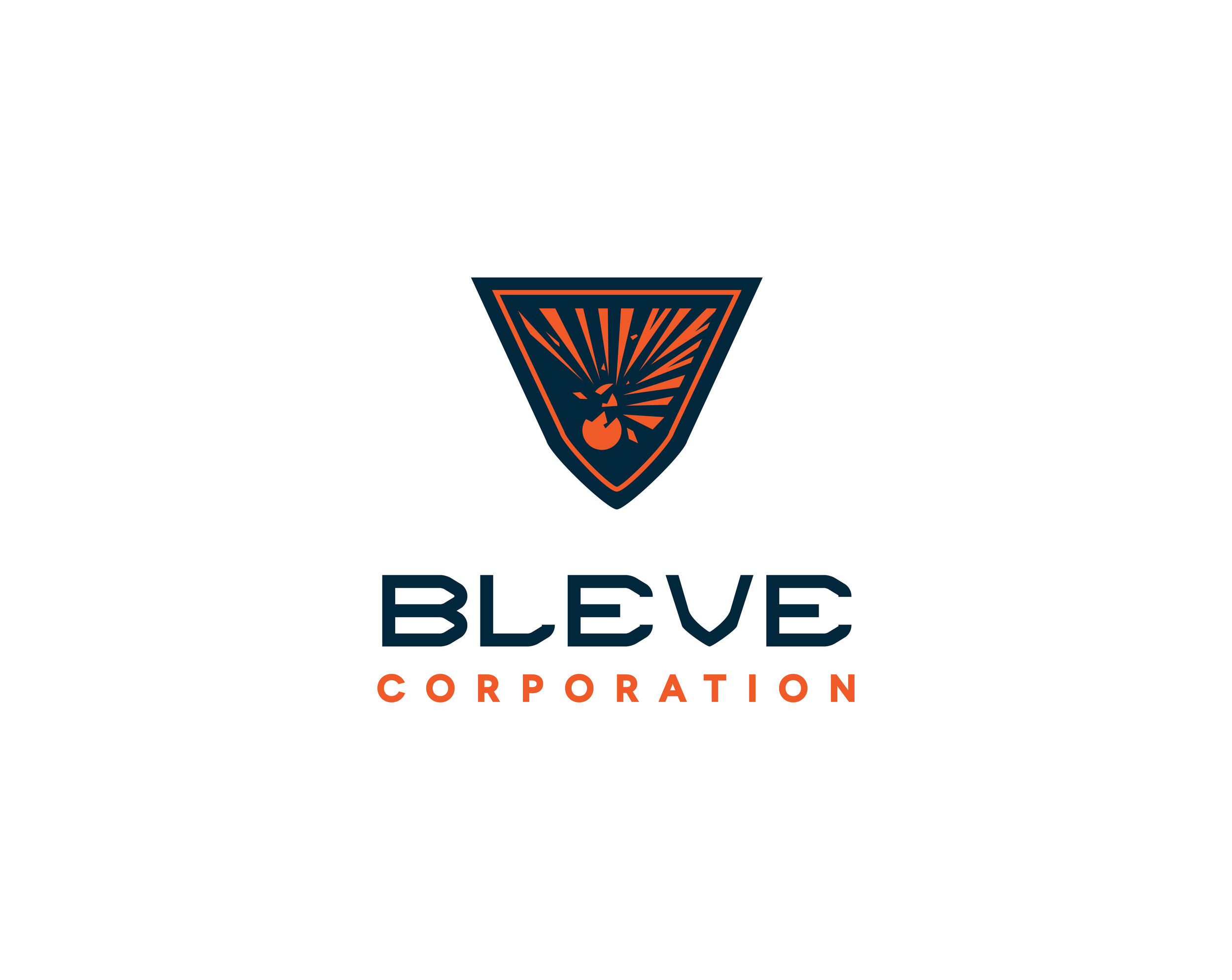
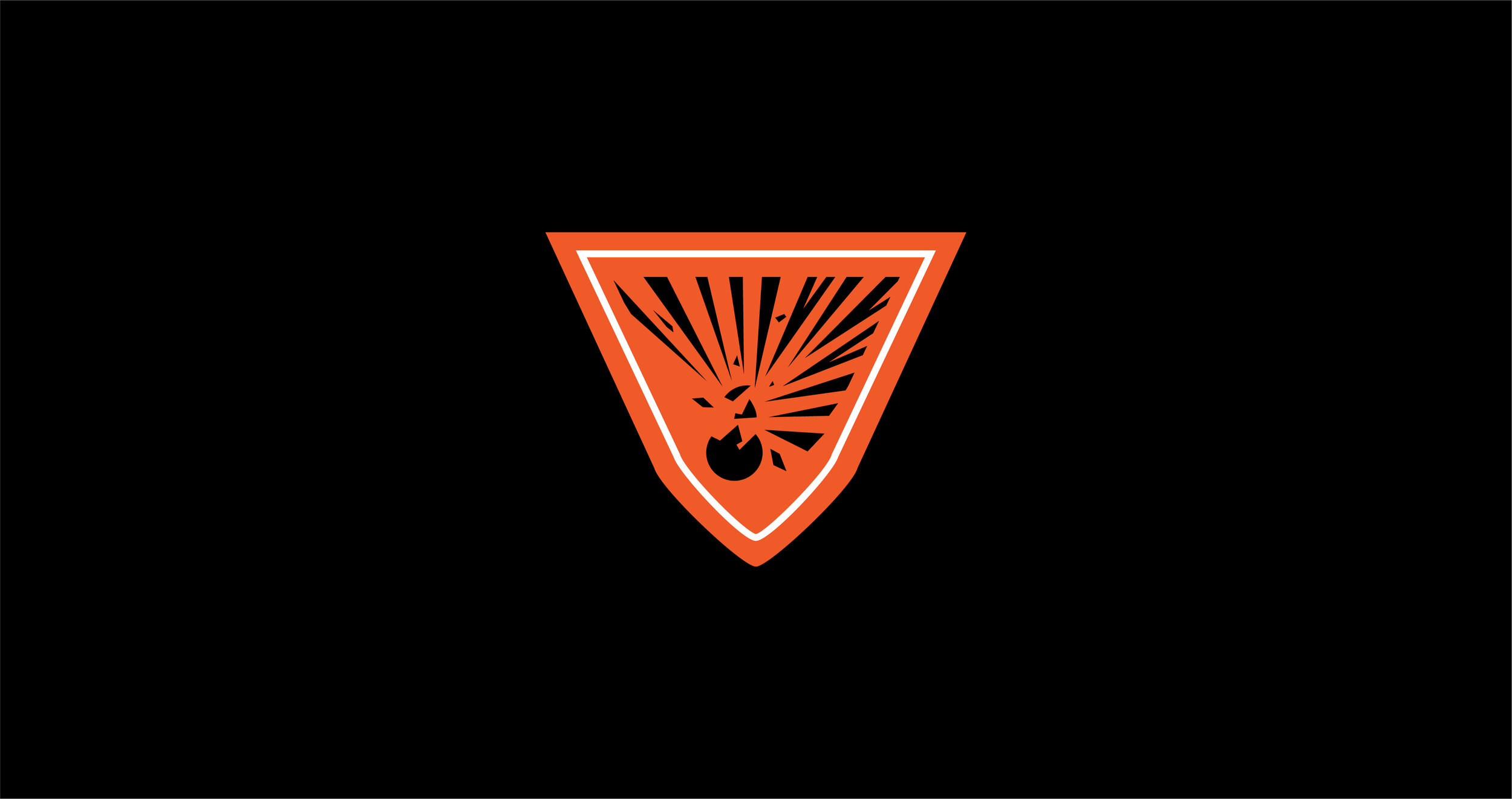
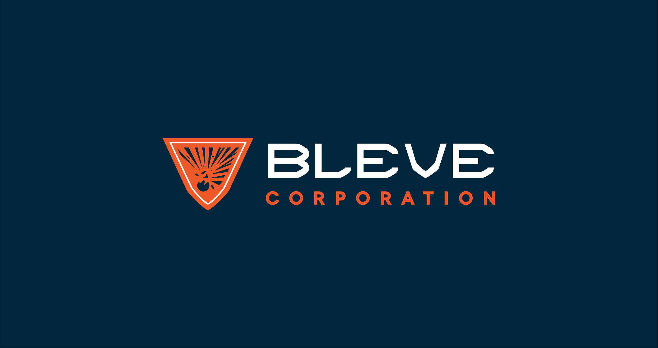
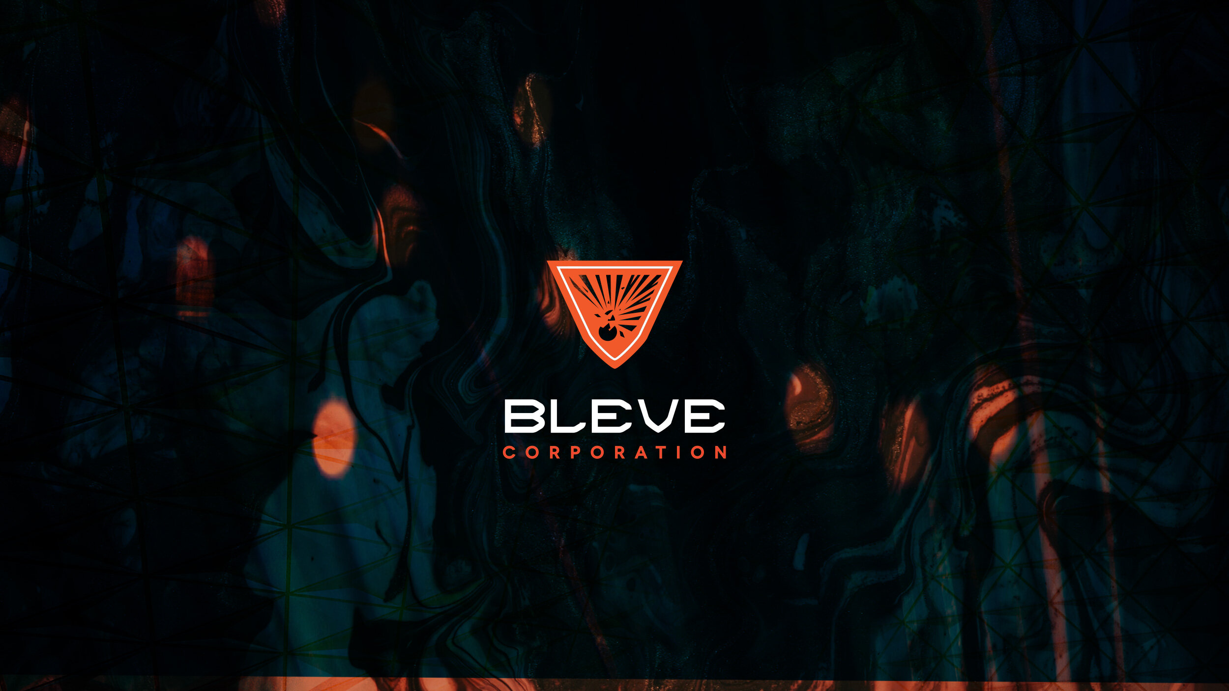
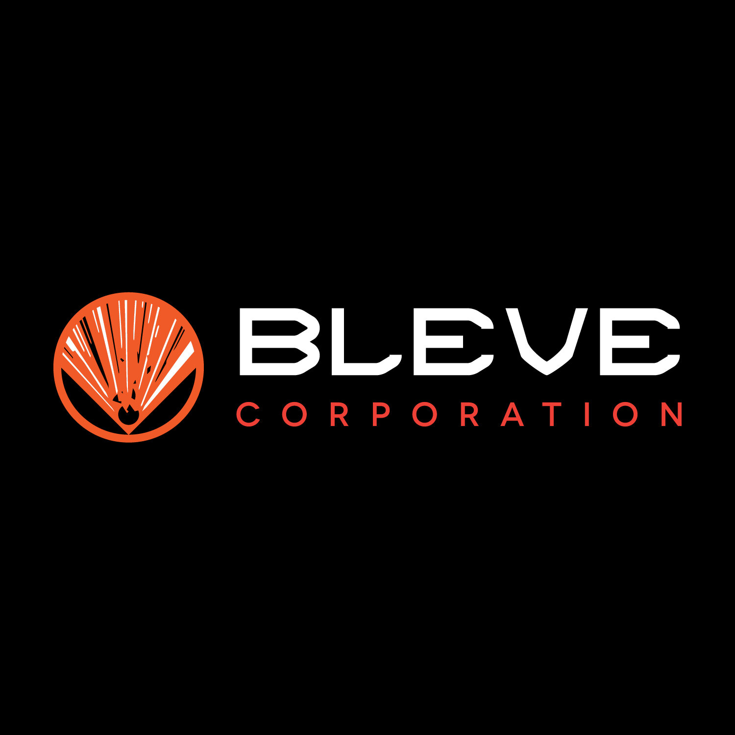
The final brand features a “V” shaped shield with an abstracted explosion at the center. The digital background was created from layering and distorting images to best convey the sensory feeling of a digital explosion.
The Concept
Boiling liquid expanding vapor explosion (BLEVE) + Digital IT
The client wanted to find a way to combine the Digital IT aspect of the company while still having a tieback to Firefighting. Thus the idea for a digital explosion was born.
First Round of Logo Concepts
With every logo project, I start by gathering information from the client through the use of a logo questionnaire, which examines the client’s objectives, likes, dislikes, and other important information before jumping into the design. Then I develop between 3-5 black and white logo concepts. Depending upon the feedback I receive after presenting the concepts, I may go into additional rounds of concepts until we get to the right creative solution.
Concept 1 - Focusing more on the digital side of your business, this concept depicts digital lines forming a “B” for the BLEVE corporation. The line work interconnects demonstrating the connective nature of the IT environment.
Concept 2 - This concept examines the overhead view of a BLEVE, depicting the shockwave radiating outward. The circles and linear lines also provide a nod back to the IT and digital aspects of dashboards and data.
Concept 3 - Focusing on tying together the digital with the BLEVE aspect, this concept showcases pixels contained within a metal tanker exploding outward.
Concept 4 - This concept examines the theme of leadership in a digital environment. The flame similar to the Olympic torch transforms and drifts off into pixels. The transformational aspect demonstrates the ever changing nature of flames as well as the IT environment.
Concept 5 - Wanting to showcase a more literal approach, this concept examines the BLEVE oil tanker explosion.
The Feedback
After completing the first round of logo concepts and sharing with the client. The client took some time to gather feedback from colleagues and family. After time and much consideration, the client determined that he wanted to go in a different direction. This gave me an opportunity to explore additional logo concept ideas. The end result was 4 new concepts and 1 final logo selected.
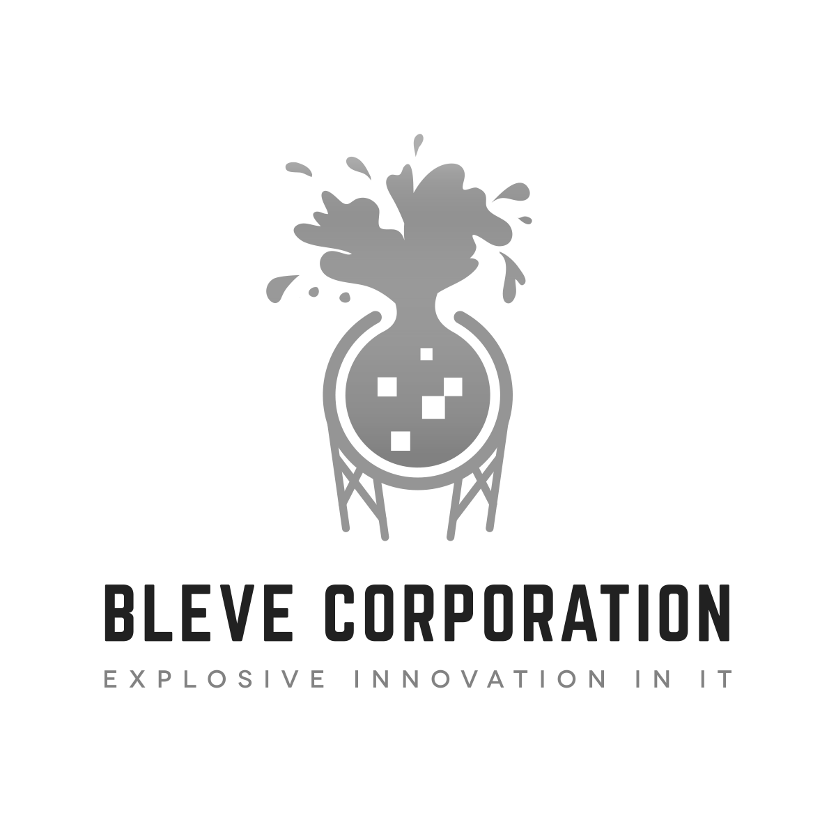
RD 2 Concept 1 - Drawing inspiration from the lab explosion symbol, this concept combines clean sans serif typography with bold graphic illustration to create a compelling brand. The explosion is shooting in an upward direction, framed on each side thus creating a central focal point for the viewer.
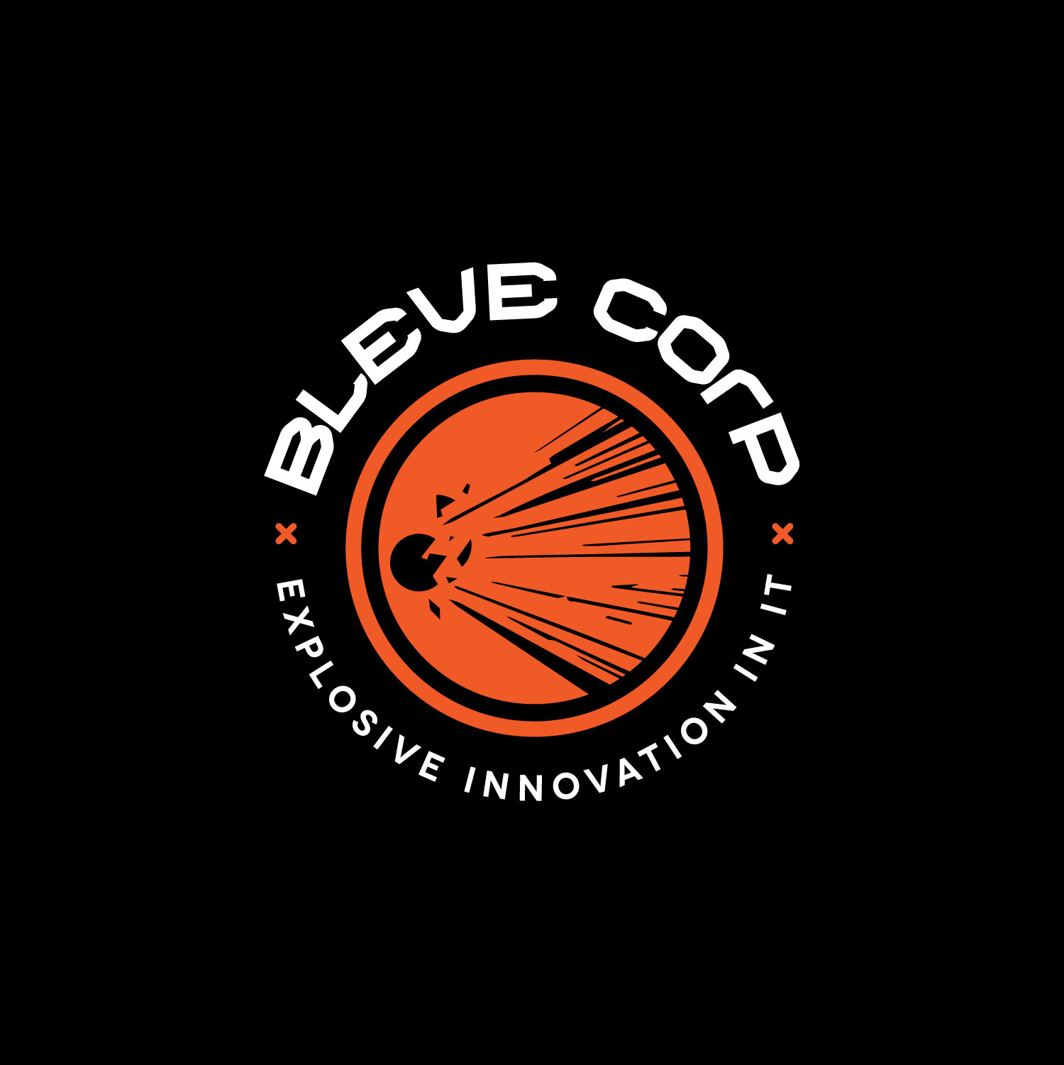
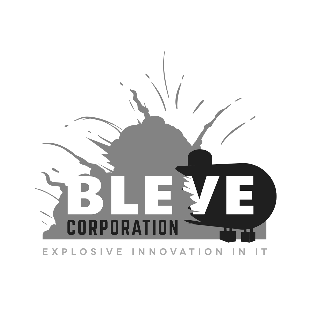
RD 2 Concept 2 - While concept 01 focuses on the upward movement of explosions, concept 02 shows directional movement. The words BLEVE Corp along with the tagline envelope and surround the brand mark.
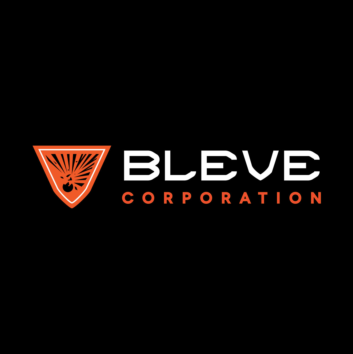
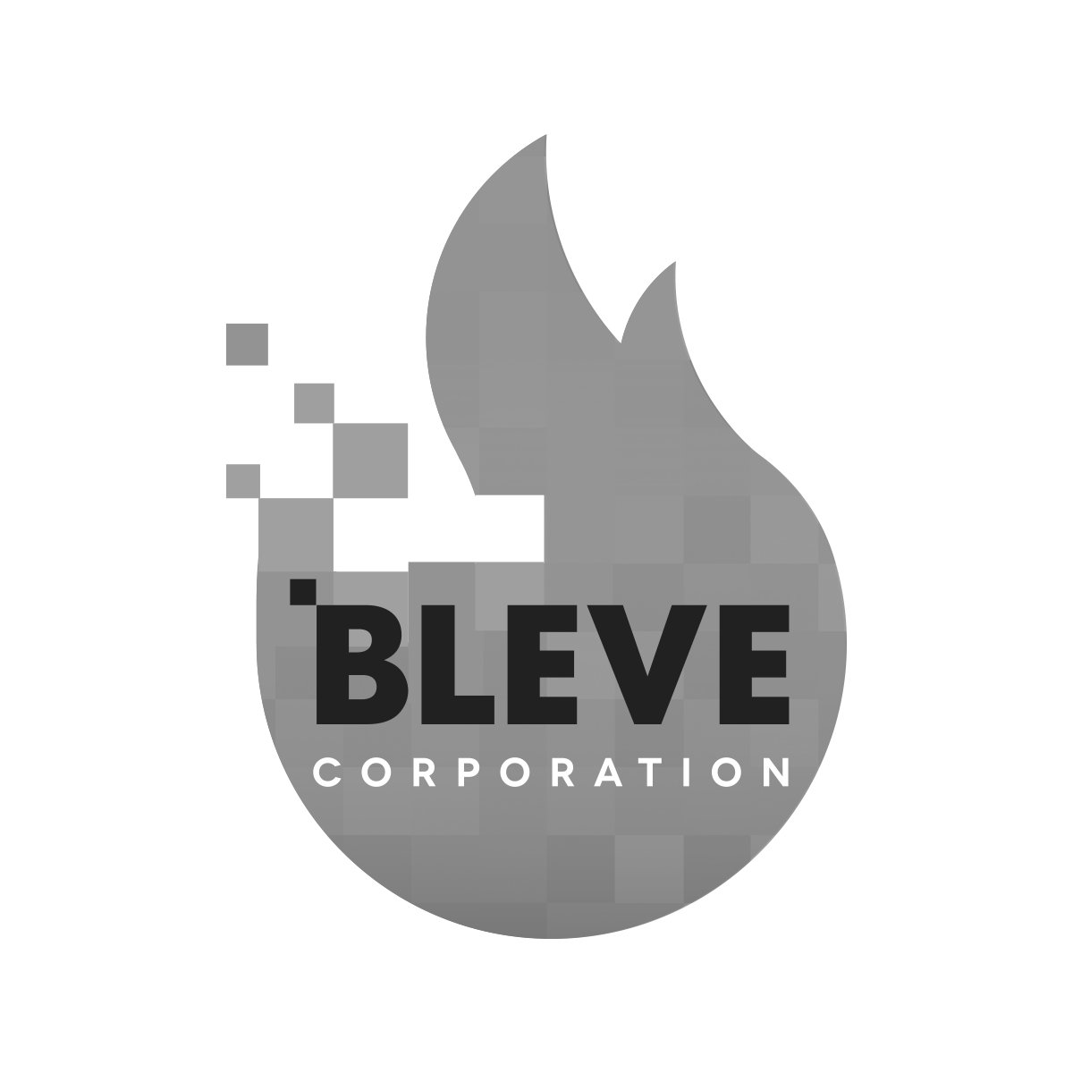
RD 2 Concept 3 (Selected Logo) - This concept features the explosive illustration captured within a the shape of the V from the BLEVE wordmark, which also looks like a shield. Clean sans serif typography is paired with the brand mark, which can either be stacked or displayed to the side of the type depending on the brand usage, (ie, for print, vs web and other applications).
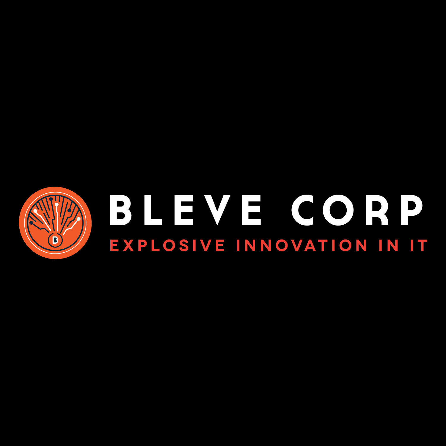
RD 2 Concept 4 - This concept takes a different approach to the explosion symbol by mimicking the outward motion of the explosion through digital nodes and lines. Everything radiates from the central “B” contained within the circle which represents the BLEVE corporation.